
Read a retention curve by checking its definition before interpreting its shape. Identify who entered the cohort, which return event counts, how time is measured, and whether every cohort has had enough time to reach the plotted interval. Only then ask where people stop receiving value and what you should investigate.
A downward line does not tell you which feature to build. It summarizes behavior under a particular measurement contract. Your job is to turn that summary into a diagnosis that can survive closer examination.
Identify what the curve actually measures
A retention chart begins with a population and a starting event. Signup-based retention asks whether new accounts return. Activation-based retention asks whether people who already achieved a particular outcome return. Both can be useful, but the second excludes people who never activated. Comparing them as if they represented the same population gives a misleading picture.
Choose a return event tied to the product’s purpose. A payroll product should not need daily visits to be useful. A communication product may deliver value several times a day. Measure against the job’s expected cadence, and state that cadence beside the chart.
Write the denominator in plain language: “Accounts that created their first real payroll in the week beginning September 7.” Write the numerator just as precisely: “Those accounts that completed another real payroll during their fourth subsequent week.” This is more useful than a chart titled “Week-four retention.”
Distinguish return-on from return-on-or-after
Amplitude’s retention documentation distinguishes returning during a specified interval from returning in that interval or any later interval. These answer different questions. An account returning in week six can qualify as retained at week four under an on-or-after definition while failing an exact-week-four definition.
For a recurring weekly job, exact-interval retention can expose missed cycles. For a less frequent job, a wider interval may be more appropriate. Neither method is inherently the correct one. Select the question first, and avoid comparing percentages produced by different methods.
Also fix the time convention. Amplitude explains that rolling windows and strict calendar periods can produce different results. A late-night signup is a simple reason calendar-day and elapsed-day counts may diverge. Record the timezone and interval rules so another analyst can reproduce your interpretation.
Check maturity before comparing cohorts
A cohort that started two weeks ago cannot provide an observed week-eight result. Empty future cells should remain unobserved, not become zero. When a tool averages across cohorts, later intervals may represent fewer and older cohorts than earlier intervals.
Use a cohort table alongside the curve. Include the starting population and the number eligible to contribute at each horizon. This makes it easier to spot a percentage based on a handful of accounts or a comparison affected by changing acquisition mix.
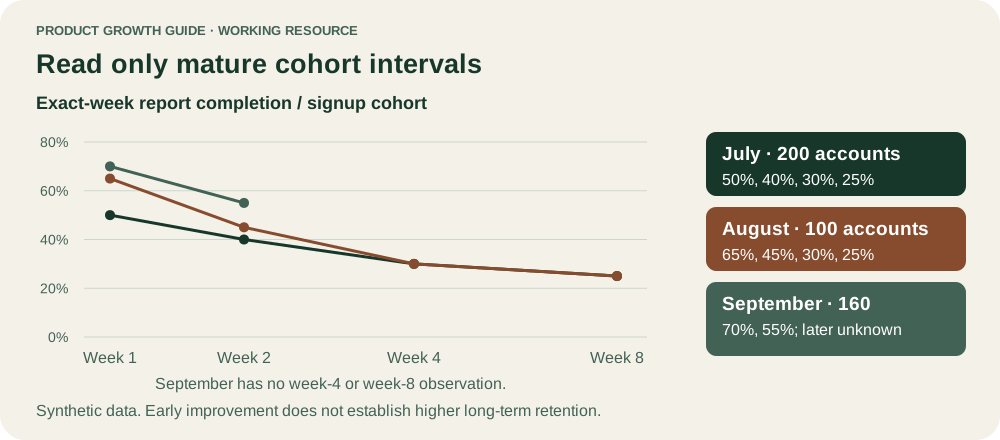
New cohorts should be compared at the same age. If September’s users appear more retained than July’s users, check whether the comparison is actually September week two versus July week eight. A prettier aggregate line can hide this mistake.
Worked example: three synthetic cohorts
The following fictional product helps teams prepare a weekly operating report. Retention means an account publishes a real report during the exact indicated week after signup. All counts and conclusions are illustrative.
| Signup cohort | Accounts | Week 1 | Week 2 | Week 4 | Week 8 |
|---|---|---|---|---|---|
| July cohort | 200 | 100 (50%) | 80 (40%) | 60 (30%) | 50 (25%) |
| August cohort | 100 | 65 (65%) | 45 (45%) | 30 (30%) | 25 (25%) |
| September cohort | 160 | 112 (70%) | 88 (55%) | Not observed | Not observed |
The August cohort has better first-week retention than July but reaches the same week-eight percentage. That supports a narrow statement: more August accounts returned early, while the available later result does not show a higher retained share. It does not establish that onboarding failed or that the product lacks value.
Suppose August introduced a guided first report. A plausible hypothesis is that the guide helps people complete an initial cycle without solving their recurring data-collection problem. Another is that August brought a different segment. Interview people who succeeded once and then stopped, and compare acquisition sources and account types before selecting an intervention.
September looks promising at week two. Its long-term outcome is still unknown. Commit to reviewing its week-four and week-eight cells when they mature rather than presenting a future plateau as established.
Use shape to choose an investigation
A steep early decline suggests examining eligibility, expectations, setup, and the first real outcome. A continuing decline later suggests examining repeated value, product reliability, changing needs, or available alternatives. A flatter section suggests a group continues returning under the measured definition. It does not guarantee that all of them are satisfied or profitable.
| Observed pattern | Investigation worth starting | Premature conclusion to avoid |
|---|---|---|
| Sharp decline before first value | Observe setup and initial job completion | More reminders will fix it |
| Good early return, weaker later return | Study repeated workflows and recurring obstacles | The newest feature caused churn |
| Stable return with declining payment | Examine packaging, budget, and unpaid use | Engagement proves monetization health |
| Lower return after faster task completion | Check successful outcomes and frequency of need | Every visit reduction is harmful |
Use these as prompts, not a diagnostic lookup table. Different mechanisms can create a similar curve.
Segment without selecting your favorite result
Begin with segments grounded in a plausible mechanism: customer job, acquisition intent, account size, setup complexity, or product version. Select those dimensions before looking for a favorable slice. Many tiny comparisons will produce interesting-looking noise.
Keep both population share and retention visible. A segment with strong retention but only five accounts is a learning opportunity, not necessarily the company’s next market. A high-retention group may also require expensive support that the aggregate curve omits.
Avoid defining a segment using behavior that happens after the outcome you are studying. “People who completed five reports retain better” may be nearly a restatement of the retention definition. Even a genuinely earlier behavior can correlate with motivation rather than cause retention. Treat behavioral associations as hypotheses for further study.
Printable curve-reading worksheet
Use this before discussing a retention chart in a roadmap meeting.
| Question | Answer to record |
|---|---|
| What customer unit enters the cohort? | __________ |
| What is the starting event? | __________ |
| What real-value return event counts? | __________ |
| What cadence does the job require? | __________ |
| Exact interval or on-or-after? | __________ |
| Rolling window, calendar period, and timezone? | __________ |
| Which cohorts are mature at the chosen horizon? | __________ |
| Counts behind the most important percentages? | __________ |
| Which segment difference has a plausible mechanism? | __________ |
| What evidence could disprove our explanation? | __________ |
| Next research or experiment and review date? | __________ |
Turn the diagnosis into a bounded test
Choose one mechanism and one eligible population. If repeated data collection is the problem, test whether a reusable import configuration helps accounts complete their next report. Track repeat completion in a fixed interval, but also monitor errors, incomplete data, and customer effort.
Define eligibility independently of treatment where possible. Comparing only people who used the new configuration with all control accounts creates selection bias. For a randomized account-level test, analyze eligible assigned accounts and use feature usage to explain the result rather than to redefine who counts.
Limits of the retention curve
Curves can miss offline value, shared accounts, deleted identities, seasonality, and jobs that end successfully. A product used to complete a one-time legal filing may be valuable despite low return. Account retention also differs from revenue retention, and paid retention can mask unused subscriptions.
Pair the curve with task outcomes and direct customer evidence. The right output is a specific question, a justified intervention, and a date when the team can evaluate enough mature behavior. Reading retention well should make the next product decision narrower and more defensible.
Sources
Something we should correct?
Tell the editors ↗